Modern Product Discovery
04 / Experience study
A study of how a focused product category can support a larger digital experience without unnecessary complexity.
Scroll
Experience study
This study examines how a focused product category can support a larger digital experience without unnecessary complexity.
- Environment
- Independent European accessories brand
- Industry
- Fashion · Accessories · Direct-to-Consumer
- Themes
- Product Discovery · Navigation · Collection Experience
Wisest Digital did not design or build the original website. This page is an editorial reading of a public environment.
Overview
This study examines how a focused product category can support a larger digital experience without unnecessary complexity.
The environment is particularly relevant because it works with a limited core product category while still creating variety and depth.
It demonstrates disciplined product hierarchy, collection discovery, strong photography, editorial campaigns and direct commercial navigation.
Context
A narrow catalogue tempts a business into adding navigation layers to make the range feel larger. The result is usually a site that is harder to move through and no more interesting.
The environment examined here takes the opposite position: fewer categories, presented more deliberately.
The environment demonstrates
- Disciplined product hierarchy
- Collection discovery
- Strong photography
- Editorial campaigns
- Direct commercial navigation
What the study examines
Five observations about depth achieved through presentation rather than taxonomy.
- 01
Focused product architecture
How a narrow product catalogue can remain interesting through presentation rather than excessive navigation layers.
- 02
Campaign integration
How campaign content and commerce coexist.
- 03
Collection hierarchy
How customers move between product groups.
- 04
Product variation
How colour, material and product variations become part of browsing.
- 05
Visual consistency
How repeated components remain consistent without making the site feel mechanically repetitive.
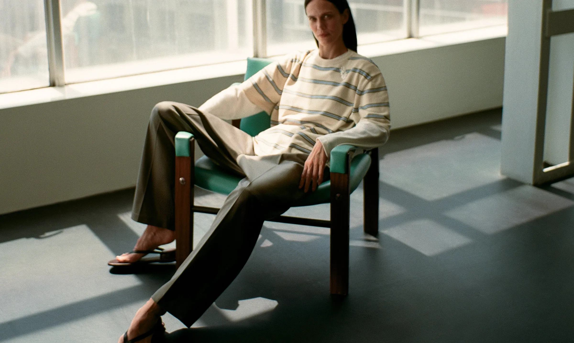
Selected frames.
Cropped compositions from the public environment, selected for what each one shows.





The experience, in sequence
Movement through a narrow range, where variation rather than category creates the sense of depth.
Arrival
One category, stated plainly.
Campaign
Editorial context before specification.
Collection
Groups a visitor can hold in mind.
Variation
Colour and material as the real navigation.
Product context
The object in a setting.
Commercial action
Short path, no detour.
Wisest Digital perspective
What the environment is useful for, and what it is not evidence of.
A focused catalogue given depth through presentation, variation and campaign context rather than additional navigation layers.
The relevant lesson is that a strong digital experience does not require more categories. It requires clearer hierarchy.
- 01
More categories rarely solve a hierarchy problem.
- 02
Variation is a more useful axis than taxonomy for a narrow range.
- 03
Campaign imagery earns its place when it carries product information.
- 04
Consistency and repetition are different things; one is structural, the other is fatigue.
- 05
A short catalogue can support a long experience if presentation carries it.
Wisest Digital did not design or build the original website. This page is an editorial reading of a public environment.
Continue

Have a project that needs more than a new website?
We work across digital experiences, systems and the infrastructure around them.