Editorial Fashion Commerce
05 / Experience study
A study of the relationship between editorial restraint and commercial functionality in fashion commerce.
Scroll
Experience study
This study explores the relationship between editorial restraint and commercial functionality.
- Environment
- Independent contemporary fashion label
- Industry
- Fashion · Retail · E-commerce
- Themes
- Editorial Layout · Product Presentation · Brand Environment
Wisest Digital did not design or build the original website. This page is an editorial reading of a public environment.
Overview
This study explores the relationship between editorial restraint and commercial functionality.
Fashion commerce frequently becomes visually crowded because every product, category and campaign competes for attention. The selected environment is useful for examining how restraint can create stronger hierarchy.
It demonstrates controlled colour, generous space, large imagery, quiet interface treatment and product-led editorial composition.
Context
Fashion has more assets than any other commerce category: campaigns, lookbooks, seasonal drops, editorial, and a catalogue that turns over several times a year.
The default response is to surface all of it. The environment examined here withholds most of it at any one moment, and is easier to move through as a result.
The environment demonstrates
- Controlled colour
- Generous space
- Large imagery
- Quiet interface treatment
- Product-led editorial composition
What the study examines
Five observations about an environment that withholds more than it shows.
- 01
Visual restraint
How reducing interface decoration increases attention on imagery and products.
- 02
Product scale
How large product imagery changes browsing behaviour.
- 03
Editorial pacing
How sections move between dense and quiet moments.
- 04
Commerce without visual noise
How shopping functions remain available without becoming dominant.
- 05
Brand continuity
How the environment maintains identity across homepage, collections, products and supporting pages.
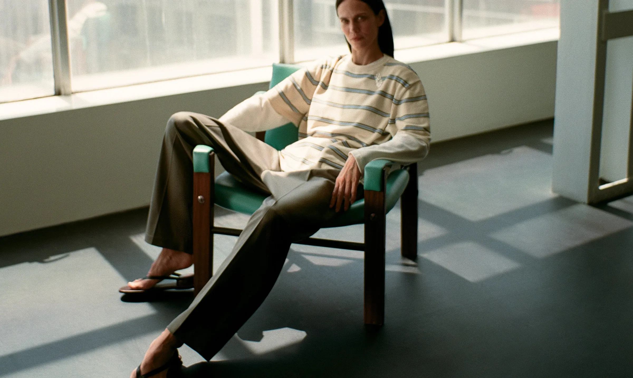
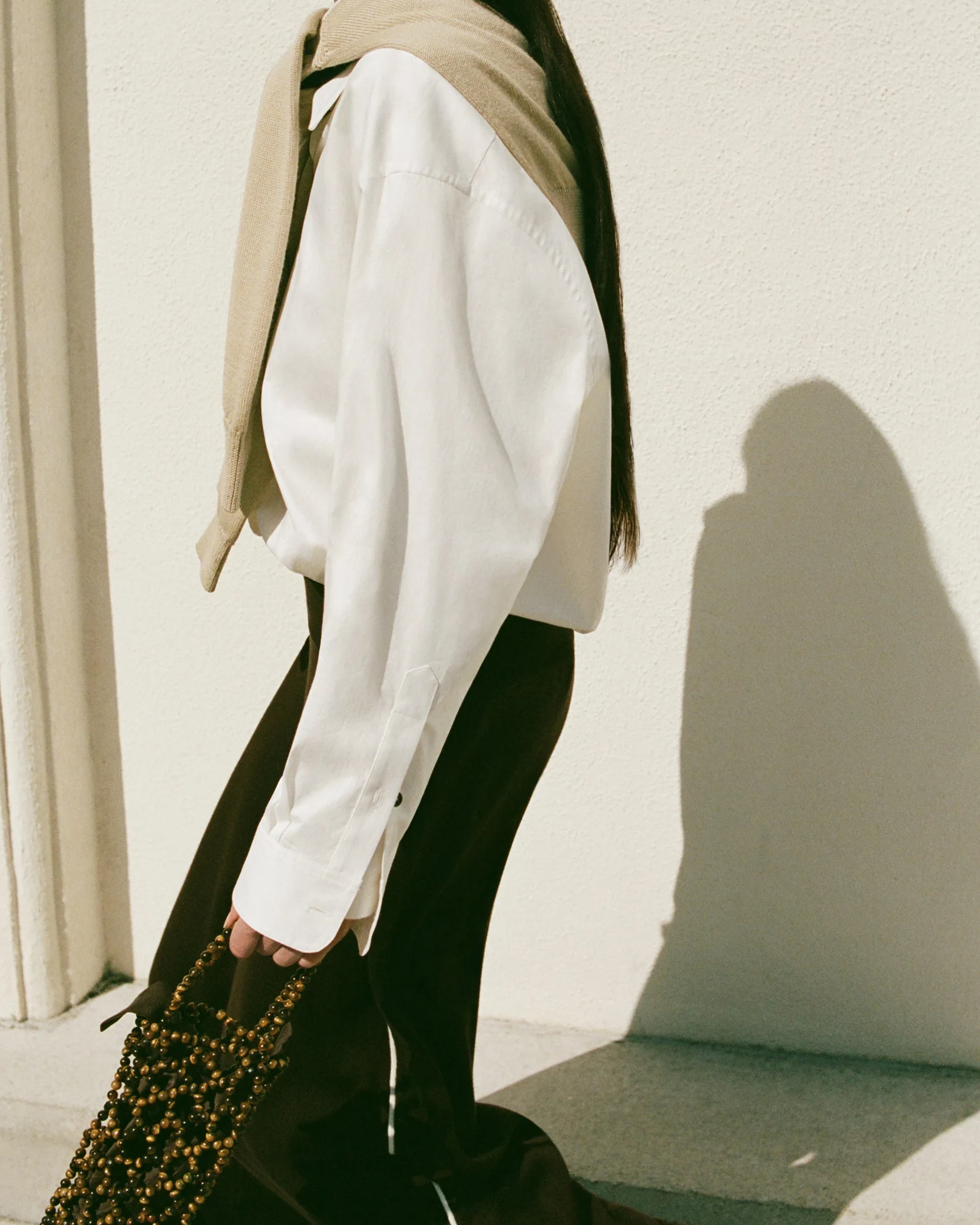
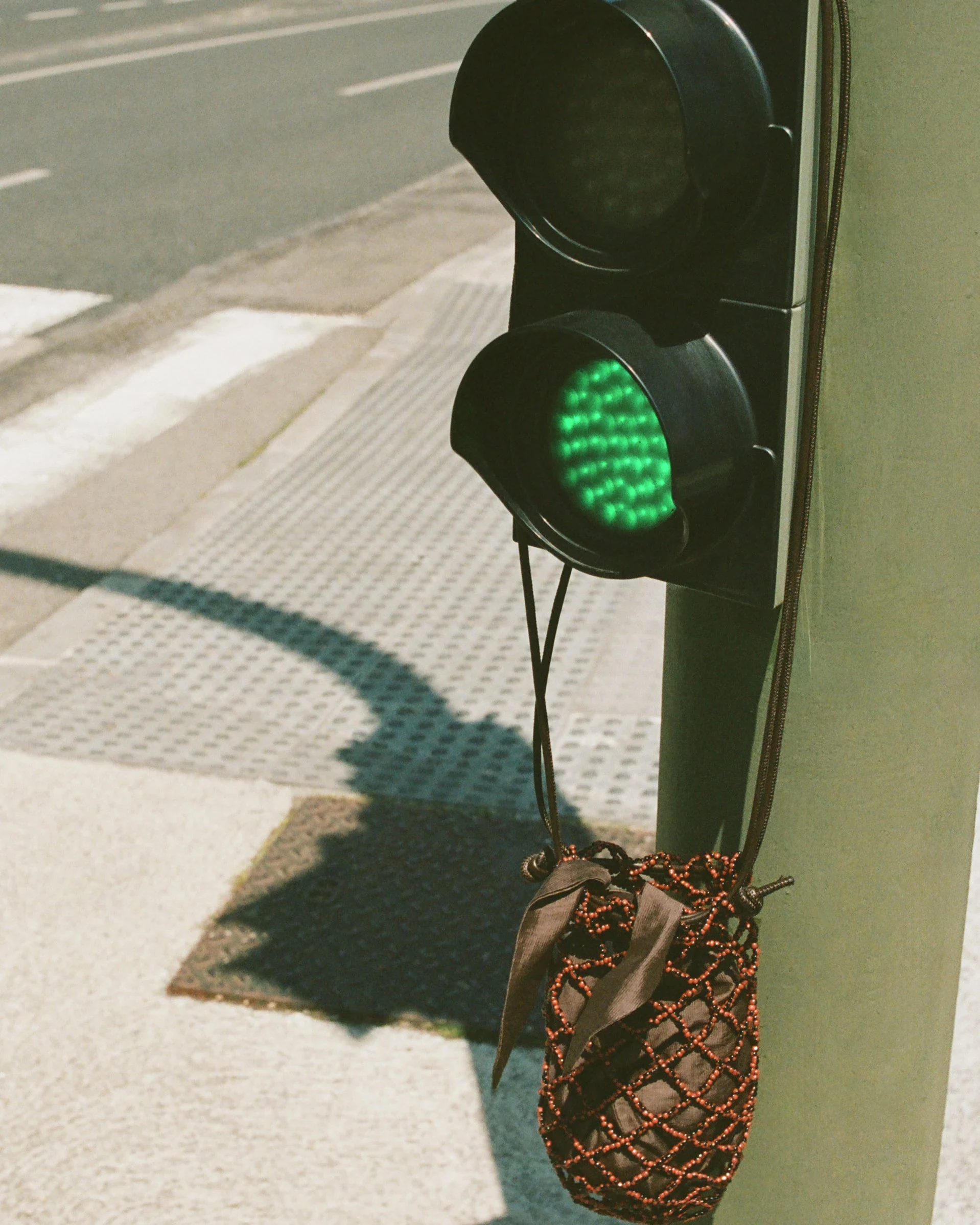
Selected frames.
Cropped compositions from the public environment, selected for what each one shows.


The experience, in sequence
A sequence in which scale, not signage, tells a visitor where they are.
Arrival
One image, given the whole frame.
Editorial entry
Season and tone before product.
Collection
Few items, large.
Product context
Fabric, drape, proportion.
Commercial action
Present, quiet, findable.
Continuity
The same environment on every supporting page.
Wisest Digital perspective
What the environment is useful for, and what it is not evidence of.
An environment where restraint produces hierarchy, and hierarchy does the work that decoration is usually asked to do.
The strongest elements are not necessarily the most animated or visually complicated. They are often the elements given the clearest position and the most appropriate amount of space.
- 01
Premium design is more often a hierarchy problem than a decoration problem.
- 02
Large imagery changes how long a visitor spends on a single item.
- 03
Interface decoration competes with the garment it surrounds.
- 04
Pacing between dense and quiet sections is what makes an edit readable.
- 05
Identity survives when supporting pages are treated with the same care as the homepage.
Wisest Digital did not design or build the original website. This page is an editorial reading of a public environment.
Continue


Have a project that needs more than a new website?
We work across digital experiences, systems and the infrastructure around them.