Editorial Commerce Experience
02 / Experience study
A study of how a commerce environment can behave like an editorial experience without losing its commercial purpose.
Scroll
Experience study
This study examines how a commerce environment can behave more like an editorial experience without losing its commercial purpose.
- Environment
- Independent premium lifestyle brand
- Industry
- Retail · Lifestyle · Direct-to-Consumer
- Themes
- Editorial Commerce · Visual Storytelling · Product Discovery
Wisest Digital did not design or build the original website. This page is an editorial reading of a public environment, published to show how we assess digital commerce.
Overview
This study examines how a commerce environment can behave more like an editorial experience without losing its commercial purpose.
Digital commerce often defaults to predictable structures: navigation, hero image, product grid, product page and checkout. The selected environment is useful because it demonstrates how those same functions can be arranged with more visual confidence.
It treats photography as structure, typography as navigation, whitespace as pacing, and products as editorial objects rather than isolated inventory cards.
Context
The commercial pressure on a retail environment is to surface as much inventory as quickly as possible. The design pressure is to hold attention long enough for a brand to register at all.
Most environments resolve that tension by making every section work equally hard, which flattens the whole experience. The environment examined here resolves it differently: it lets some moments carry almost nothing.
The environment demonstrates a restrained approach to
- Pacing
- Image hierarchy
- Typography
- Product discovery
- Negative space
- The relationship between editorial content and commerce
What the study examines
Five observations, taken from the environment as a visitor meets it.
- 01
Editorial hierarchy
How large visual moments are balanced with smaller informational elements.
- 02
Product presentation
How products enter the experience without immediately collapsing into a conventional grid.
- 03
Image rhythm
How image scale and spacing influence the pace of browsing.
- 04
Typography
How restrained typography can carry hierarchy without excessive interface decoration.
- 05
Commercial structure
How navigation and conversion functions remain available without dominating the visual experience.
Selected frames.
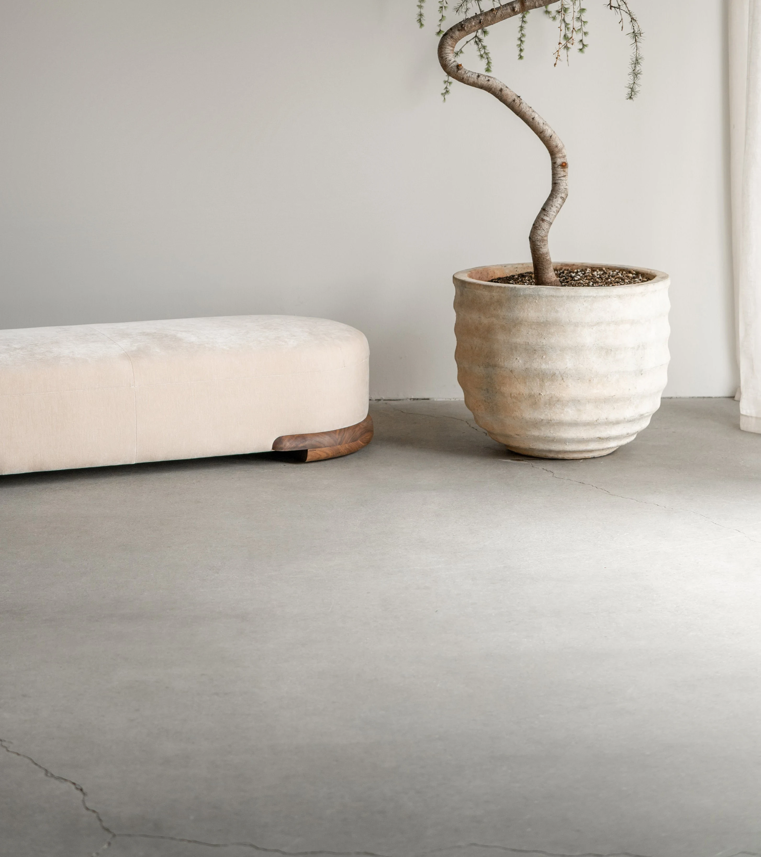
Cropped compositions from the public environment, selected for what each one shows.




The experience, in sequence
The route a visitor takes when the environment is arranged as an edit rather than a catalogue.
Arrival
A composition, not a menu.
Editorial entry
Atmosphere established before inventory.
Product exploration
Objects presented at their own scale.
Product context
Material, proportion, setting.
Commercial action
Available throughout, dominant nowhere.
Return journey
The environment holds after the transaction.
Wisest Digital perspective
What the environment is useful for, and what it is not evidence of.
A commerce environment where brand atmosphere and product discovery operate together rather than competing for the same attention.
The relevant lesson is not to reproduce the source design. The value lies in understanding the principles behind it, and in knowing when a commerce environment is being asked to do too much at once.
- 01
Interface noise competes with the product it is meant to sell.
- 02
Photography can carry hierarchy that would otherwise need a heading.
- 03
Sections that all work equally hard read as a page with no argument.
- 04
Scale changes are the cheapest way to create pace.
- 05
Quiet moments make dense moments legible.
Wisest Digital did not design or build the original website. This page is an editorial reading of a public environment, published to show how we assess digital commerce.
Continue


Have a project that needs more than a new website?
We work across digital experiences, systems and the infrastructure around them.